Founded in 1992 by brothers Shawn and Aaron Brauch, the Houston-based graphic design firm Pen & Pixel Graphics became the ultimate visual architects of Southern Hip Hop’s “bling-bling” era.
Serving as the definitive house style for powerhouse labels like No Limit Records and Cash Money Records, the studio completed over 19,000 album covers defined by a surreal, unapologetic “more-is-more” aesthetic.
As art director, Shawn Brauch leveraged early, technically restrictive digital design software to pioneer a distinct visual language packed with diamond-encrusted typography, explosions, stacks of cash, luxury cars, and larger-than-life environments.
Instead of relying on stock photography, the team meticulously orchestrated custom photoshoots, photographing items like 50-caliber bullets or jewelry from precise angles to build an archive of high-glitz assets.
While the physical studio closed its doors in 2003, Pen & Pixel’s pioneering work has transitioned from regional nostalgia to universally revered fine art, permanently cementing the visual ambition, wealth, and mythology of 1990s and 2000s rap culture.
The Hip Hop Museum caught up with co-founder Shawn Brauch about the studio’s early days, the technical process behind the production of the album covers, some of the wildest photo shoot stories, the studio’s legacy within Hip Hop and more.
Adam Aziz: Can you start off by telling us your name and what you do with Pen & Pixel?
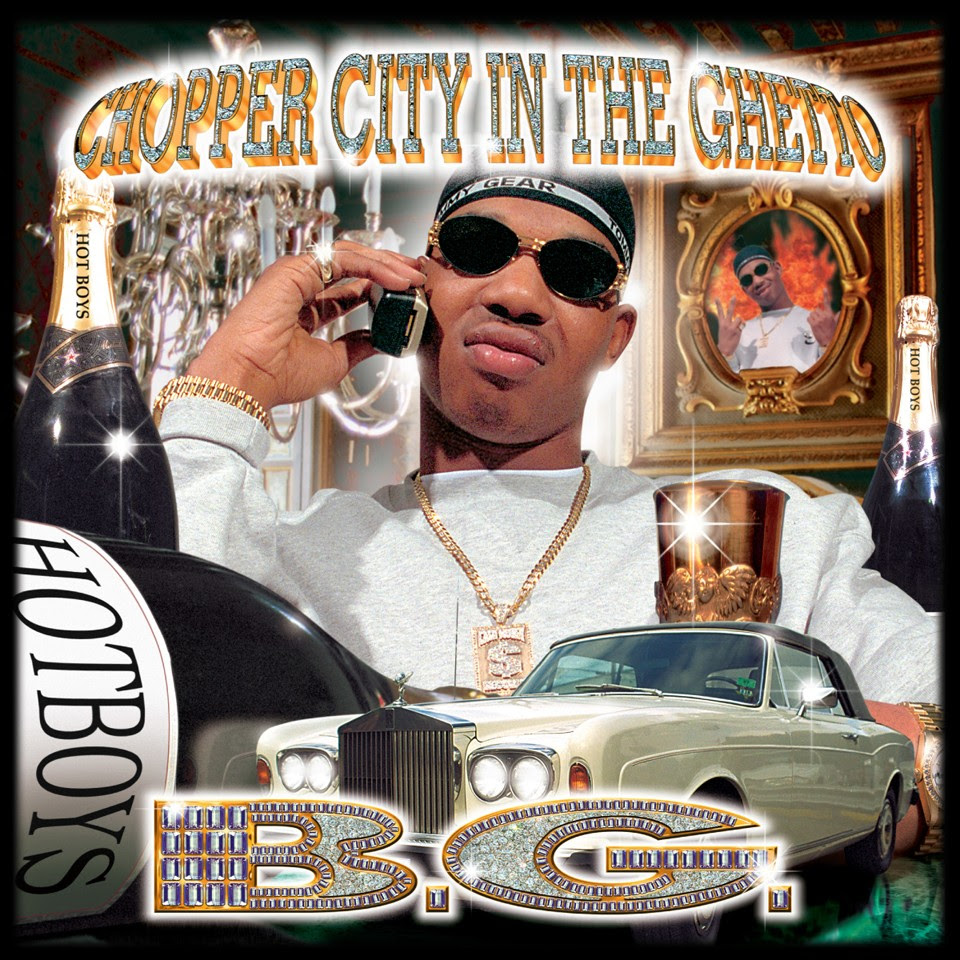
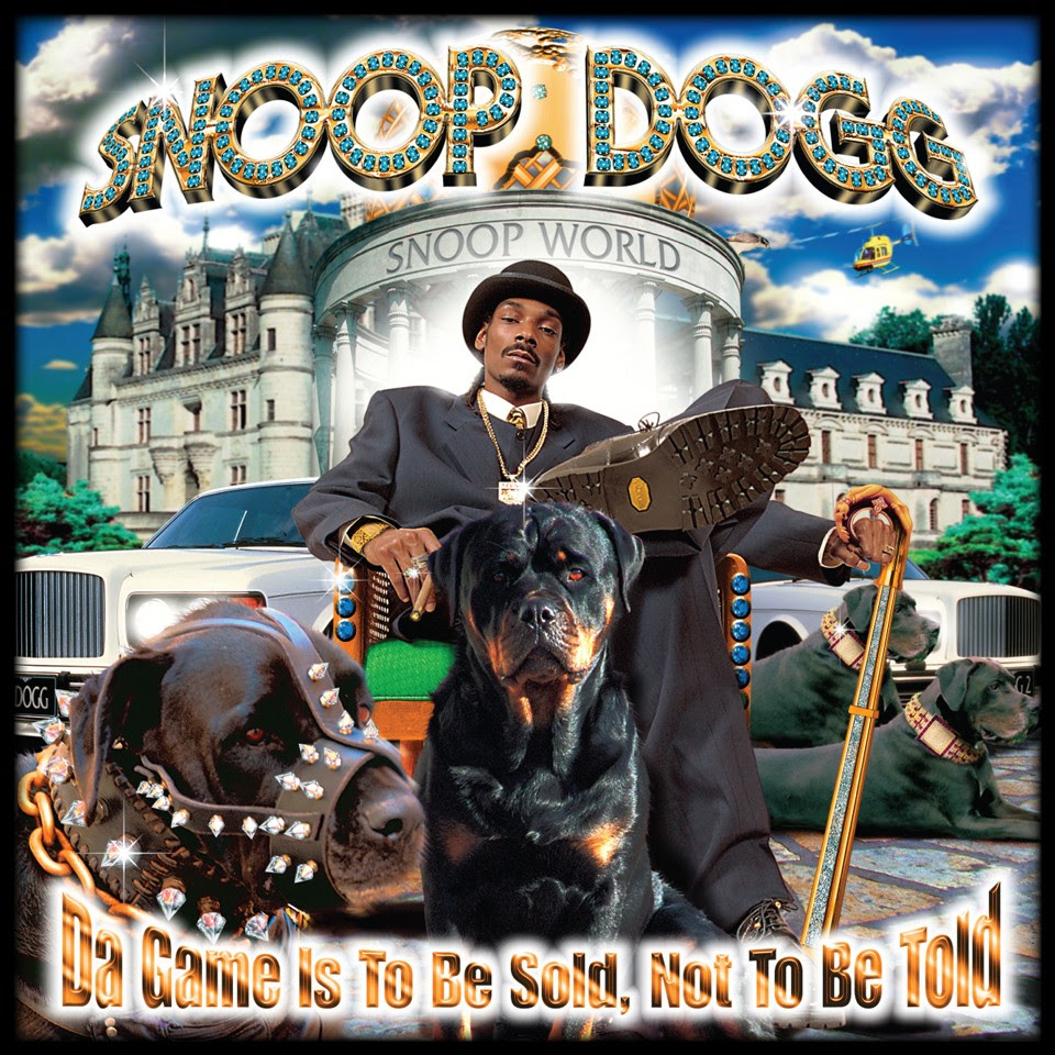
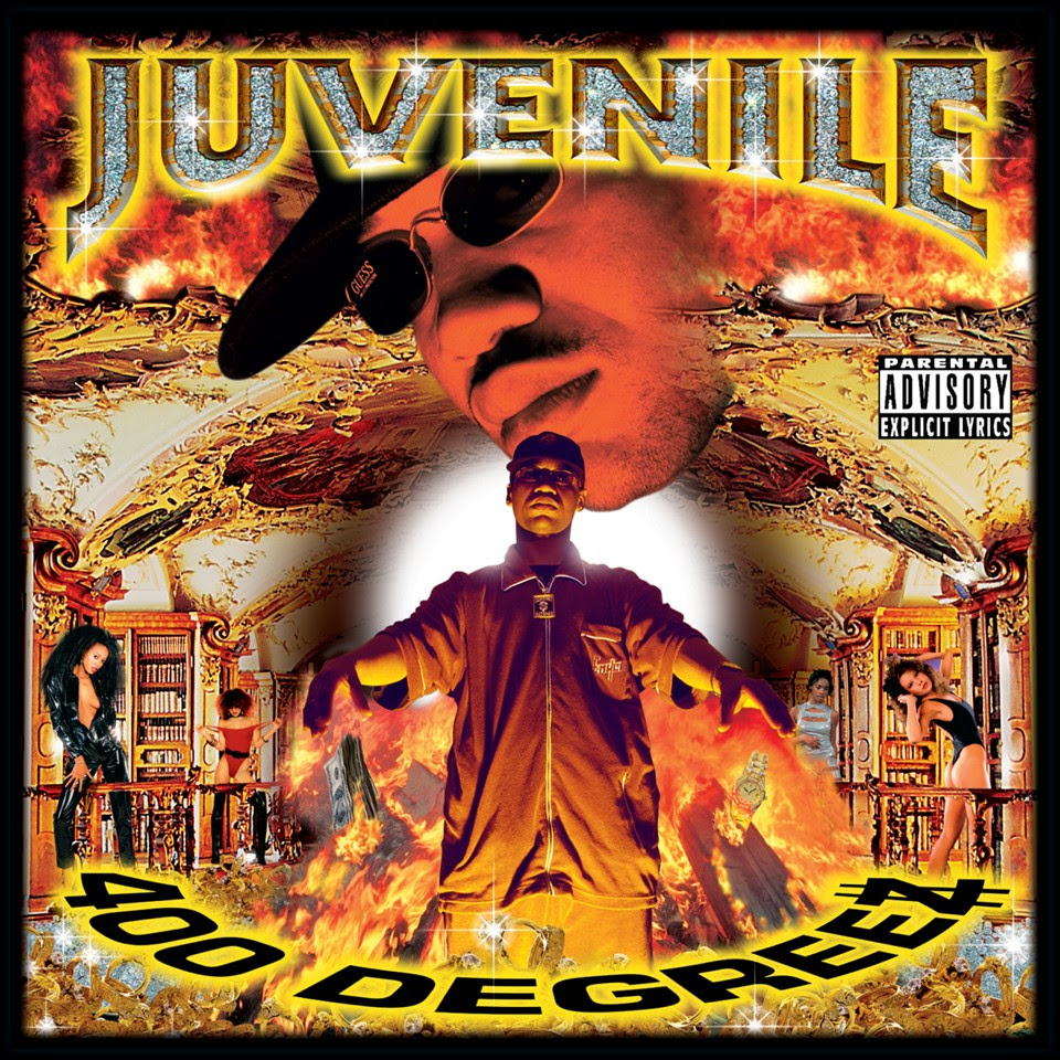
Shawn Brauch: Yeah, so I’m Shawn Brauch, and I was co-founder of Pen & Pixel Graphics, which started in 1992, and we terminated in 2003. We had an 11-year run, accomplished about 19,800 album covers in that time, and worked with about 6,000 to 8,000 clients, and basically set up the South for that bling bling look of over-the-topness, maximalist, outrageousness, and that’s what we did.
AA: Where did the Pen & Pixel name come from?
SB: So, the Pen and Pixel name, my brother and I were conceiving the business plan. And back then, as was throughout the length of the company, we did a lot of sketching before we did any kind of photography work or anything else. And that was one of our advantages. I’m a classically trained artist. I went to art school, so I had the hand skills that a lot of people don’t use very much anymore, which I’m kind of surprised by. So we could sit down in front of the client, and they could talk, and we could listen to the music, and I could just start throwing these sketches down really, really quickly and start shooting concepts off to them. And then, of course, with those sketches, that would be the recipe for the photography, and then the final artwork, which was all done on a computer. So pen, and then of course, translation to pixel, pen and pixel.
AA: When Pen & Pixel started, many album covers, especially rap albums, were very understated. How did you even come up with that gaudy, over-the-top look that Pen & Pixel came to be known for?
SB: It’s almost like a seed for your imagination. So clients would come in, and they’re like, yeah, I want to be next to my ‘64 Chevy. I want to be holding a blunt. And, you know, I want my girlfriend to be resting across the top. And I was like, okay, well, that’s cool. What about having a golden eagle behind you with a gold chain of your logo on it? He’s like, well, how does that happen? I was like, well, the same way that I’m going to take your hand with the blunt, and I’m going to put it front centre with your ring on it, with your company logo, gold and diamond background behind the eagle that’s wearing it because you know you’re coming from an area where the Eagles are your main team and you’re a big Eagles fan.
In order to do that correctly and to make it look great, we’re going to shoot every single thing individually: the car, the girl, your hand, the eagle, the logo, and we’re going to incorporate all. So they started to think, they’re like, well, it’s very similar to how my music track is put together, where I’ll throw down a beat, I’ll have a producer come up with a lick, we put that together, then I’ll throw down some lyrics. And it will start mixing that stuff up. And I said, identical, except in a visual realm.
AA: What was the first rap album you guys did?
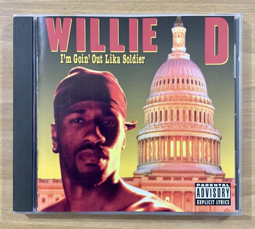
SB: It was for Rap-A-Lot Records and Willie D and his album ‘I’m Goin Out Lika Solider.’ Totally professional photo shoot for him, because he was cut, he was a fighter. And then we took that, put some yellow or orange gels on it, and then put him in front of a wall that we had created, and then the burning Capitol building in the back. And that was all done on a computer.
Once that first cover came out, people were asking how you get him in front of the Capitol building that’s burning, and how did you burn down the Capitol building? And this was in 1991, 1992, right? So Photoshop 1, right? Yeah, lots of learning to do on Photoshop 1.
AA: When you completed that first cover, what were you guys thinking? Did you think people would love this concept?
SB: I mean, these covers, for the most part, have a humorous element to them, but they do have a statement that’s made. And this was one of those political statements, which we’ve done a lot of political-type covers before. And this one came out, and people were like, ” Wow, that’s cool.” And we had no idea. All we knew was that we had accomplished it after crashing the computer 65 times.
We’re like, wow, we actually got this into production. It actually worked. And of course, my brother and I would take meticulous notes of everything we did right and everything we did wrong. And those notes were put into a computer, and we would label them on how to build an album cover. And this was back in 1992.
So we started with Adobe being a beta tester for them, and we would send them this, which is what works with this filter. This does not work with this filter. This is what works with this much RAM. This is what works with this much hard drive space. This does not. And so they would go into this thing, and they’d be like, oh, can you tell us more about how that file was processed? And it was like, well, we did this, and then we had to break it.
AA: What was it like for you and your brother as you became more integrated into Hip Hop?
SB: My brother and I are all about business, right? We’re businessmen. So, as a business person, you see an opportunity that needs to be filled. And we both have different talents. My brother is an extremely good businessman. And he’s a systems guy. He can put a system together, and he has massive connections in the music industry from Rap-A-Lot.
So with that and his business background, he was a Cornell graduate, smart, smart guy, brought that together with my art background, and we both have the same sort of personality. We never stop, we never give up, we’re gonna satisfy the customer.
AA: As the popularity of Pen & Pixel grew, did you and your brother ever give thought to moving away from the gaudy album covers?
SB: We had the full capabilities in graphic design. So we did a lot of stuff. We had Ferrari as a client. We had the Houston Rockets. We had Budweiser. We had Miller. We had Universal Pictures. We had a whole bunch of other stuff, HBO, DreamWorks.
We had a whole other genre, jewelry catalogs, high-end jewelry catalogs. So anything that required a high degree of photo retouching or special effects, we at that time were the special effects house in the South. So if you needed something done, Ferrari, for example, needed their cars retouched, colors changed, and put on a racetrack. That’s us.
The interesting part about Pen & Pixel is that people look at Pen & Pixel, and they’re like, well, it’s the craziest artwork you’ve ever seen. And that’s how the money was made and everything else. It’s actually the tip of the iceberg. The artwork was only a very, very small piece. It was the most visible piece, but underneath that, you had CD manufacturing and printing; we had a mastering lab, a digital recording studio, a video recording studio, a photography lab, a replication plant, and distribution.
Plus, we had a concierge service that would handle your security, hotel, and transport. We had all of that underneath there. So the clients would come in for the artwork and were like, ” Okay, you’ve got a custom level piece of artwork that is going to get major distribution. We can handle that distribution for you.”
AA: As you and your brother got more integrated into Hip Hop culture, any interesting stories that come to mind?
SB: Yeah, I mean, there’s a couple. One story in particular, which was one of the most memorable for my crew and me, was Criminal Element. The band was called Criminal Element. The cover is very rare. The cover ended up being a train which was attached to a dog. And there’s a racehorse behind it and a ’64 blue Chevy convertible. And then the guys faded out in this dark, stormy thing. And then Criminal Element is spelled incorrectly; that’s the way they wanted it.
So then their manager is like we want our pit bull on the front cover in that position on this horse, on this train. The train represents something that can’t be stopped, right? A locomotive so powerful it can’t be stopped. And the manager says, “When can we bring the pit bull in to get it photographed?” And I’m like, well, we have a big studio. What could possibly go wrong? I should have known.
The studio was large enough to put a car in. So, you know, 5,000 square foot studio, right? So they backed this pickup truck in; it has this metal box cage thing on the back of it. And the guy gets out of the car, and he’s got a 9 millimeter in his waistband, and a baseball bat and a chain. And he’s like, yeah, you all want to get on the ladders now. I’m like, I’m gonna get on a what? He’s like, you need to get on those big tall ladders. And I was like, this is nuts. Opens up the back of this thing and pulls out a treadmill, like a wooden treadmill that they train these fighting dogs on, right? It’s no joke. Takes like three guys to bring it out. I got my camera all set, prearranged. And he’s like, okay, you guys got to get up on the ladders. He goes, I’m going to bring the dog out now. He brought this dog out. This thing must have been, I don’t know, 80 pounds, solid muscle and absolute gnarling, scratching, biting, the whole thing. I was like, ” Oh, this is insane.” And he comes up, and he ties it to the treadmill, and I’m still on the ladder.
And this thing starts running on the treadmill, like at the lens. And he’s like, y’all need to come down here and shoot these pictures now. He goes, I’m right behind you. I have a gun. And I’m like, what could possibly go wrong? I’m sitting there speed shooting. This dog gets close to me, probably five feet away and just goes nuts. All of a sudden, the treadmill, they’re made of these wooden planks, starts breaking off.
And the guy was like, “Get back on the ladder, get back on the ladder.” I run up the ladder. This thing just disintegrates, and this dog is pulling this treadmill, trying to get up the ladder. Grabs the dog, hits it in the head, doesn’t do anything, picks it up, and literally manhandles it back into this box, this metal box.
We were just shaking, absolutely shaking. I’ve never been around a wild animal that was trying to eat me while I’m trying to do a photo shoot.
AA: Wow, that’s a wild one. We’ve talked about album covers. Can you talk about some of the iconic logos you’ve designed?

SB: We got a couple of good ones in there. We got Three Six Mafia. We’ve got Hypnotized Minds. We got Cash Money Records. No Limit came in with their own rendition of the logo, and we re-rendered the logo for them, just tightened it up a little bit, but they had already come in with a pretty solid logo. Most of the acts that came in had what I call a napkin sketch logo, where they’d sketched it out and sort of rendered it. And we were like, let’s tighten that up.
AA: What are some of your favorite covers that Pen & Pixel has produced?
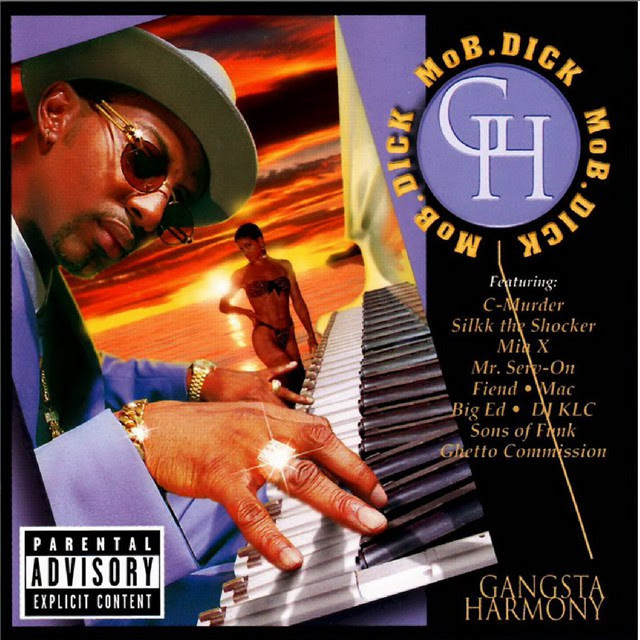
SB: I like the iconics, there’s no doubt about it. Big Bear, I like a lot of humor, or I like a lot of thought-provoking elements that are on the cover. Ones I would put together after talking in depth with the client.
Mo B. Dick’s another one. The gentleman’s a Jazz musician. His cover is him, dressed in purple, playing this beautiful piano. classic, right? Beautiful. Little chick in the back in the sunset. I was like, hey, it’s a jazz thing. Until you look at the keys. And the keys are 9 millimeters.
I mean, it took forever. There are 88 of them. 88 different pictures for each one of those guns, placed in Photoshop.
AA: At the height of Pen & Pixel, how much were people paying to have you do their covers?
SB: We had classes from three hundred and seventy bucks all the way to six to ten thousand, depending on how far you were going to go.
Cash Money type covers were anywhere from thirty-five hundred to four thousand. No Limit was probably around twenty five hundred to three thousand.
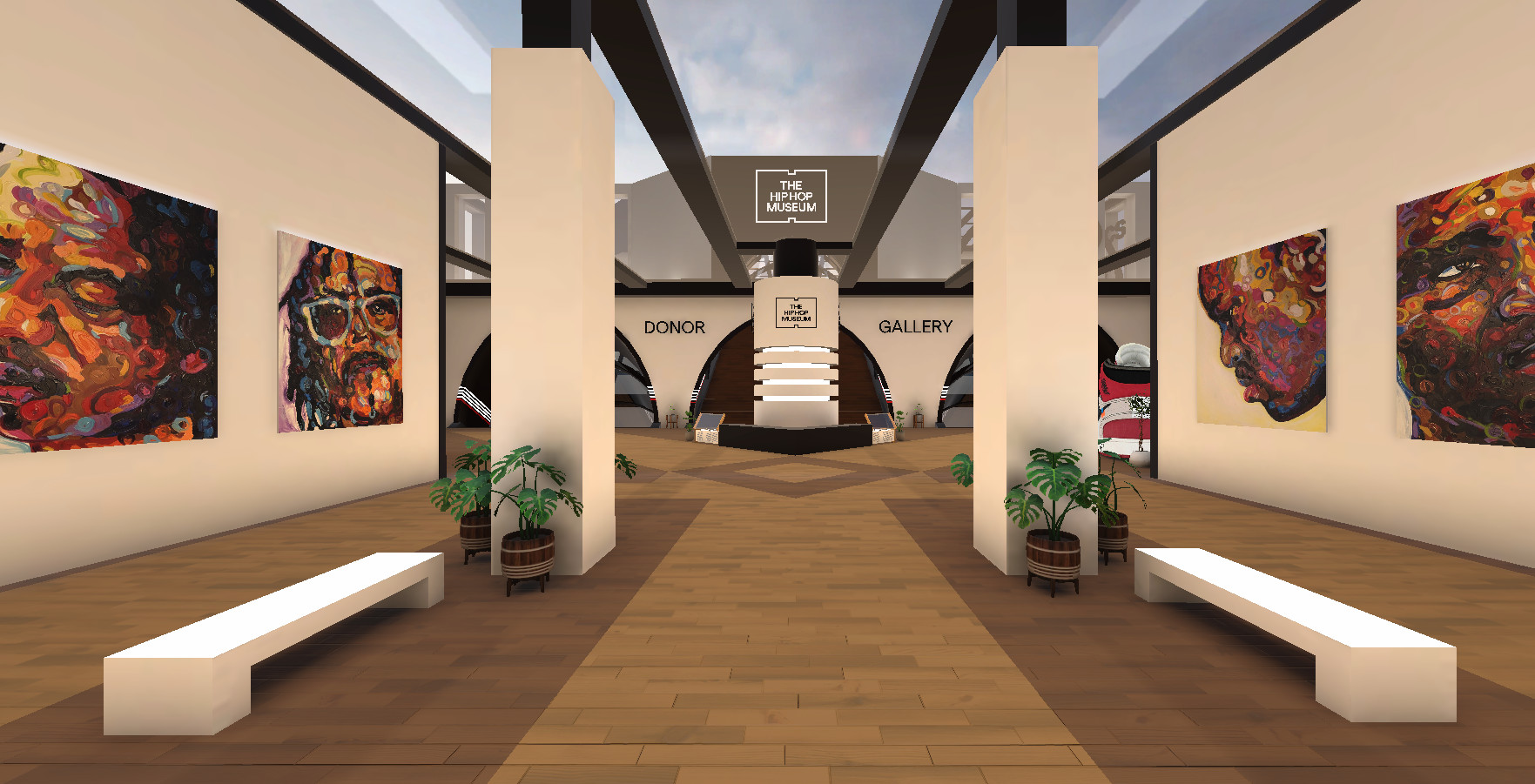
AA: You’ve made some donations to The Hip Hop Museum. Can you talk to me about them and what makes them special?
SB: The first set of donations is going to be one hundred and eighteen high-impact pieces, including prints and digital files.
These would be culturally changing pieces or pieces that had shown some sort of diversion from our normal Pen & Pixel stance. There were these little hopscotches throughout our growth. Some of them were political. Some of them were deeply personal. Some of them are ridiculous, but all of them have that flavor, that carryover flavor, which, when you look at the spectrum of it, it can go from pretty serious to just amazingly funny and creative. But that first round of donations is what I think really defines our spectrum of Pen & Pixel.
AA: Why do you think it’s important Hip Hop has its own physical Museum space?
SB: I think the growth of Hip Hop happened so fast. I mean, there were slow beginnings in the Bronx, but then boom. I always looked at it as poetry, and I love poetry. And I was like, wait a minute, there’s a lot more to what they’re saying. You start looking at those lyrics, and you’re like, there is a serious message going on here, and that’s when it was political. And it started waking people up and saying, “Hey, we can start putting our words out there and have people listen to them and enjoy it.”
And then the production started to get better and better. And I was like, this is legacy stuff. And watching that grow and being part of that legacy and having the ability and the privilege of defining the look of it for the South was something that I wanted to be able to leave for future generations. I want them to know the story. I want them to understand how the South developed, not just East Coast and West Coast, but how that whole thing grew together and why we have such a different sound. Southern rap has a completely different flavor and sound and a different look.
Follow Shawn Brauch on Instagram.